ZAC KING FARRIERS
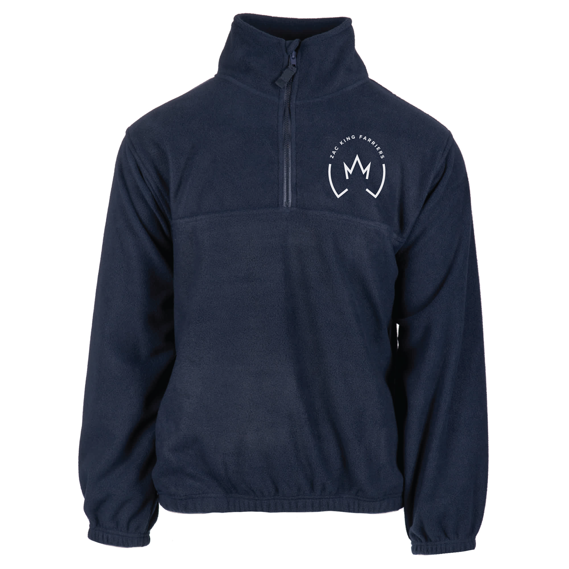
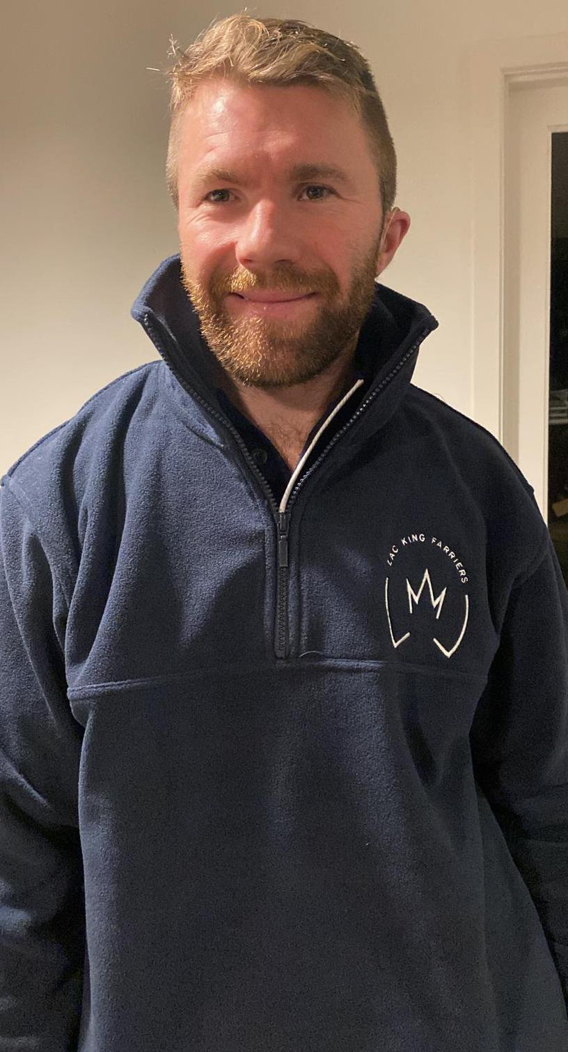
The Zac King Farriers logo was designed for a farrier business owned by Zac King, a professional farrier who provides services to clients in the equine industry. Zac's work involves the care, shoeing, and maintenance of horses’ hooves, and his clients range from private horse owners to larger equestrian facilities and horse racing. With a focus on quality craftsmanship and professional service, Zac wanted a logo that would reflect the strength and reliability of his brand while maintaining a sense of elegance. The logo is featured on various touch points, including merchandise such as polos and quarter zips, as well as the company van, invoices, and potential sponsorship opportunities for sporting clubs. The logo serves as an essential part of Zac's visual identity, conveying his professionalism and expertise to a wider audience.
With the design process, the goal was to create a minimal yet strong logo that stood out without relying on the usual horseshoe symbol. I opted for a crown to represent "King," which not only aligned with the business name but also gave the logo a bold, professional aesthetic. During the process, I noticed that the crown shape began to resemble the bottom of a horse’s hoof, particularly the frog, which was a happy accident that enhanced the concept. This discovery made the design even more fitting for Zac’s business. The final result is a clean, modern logo that is versatile and works seamlessly across various media, including merchandise, the van wrap, and invoices, ensuring that Zac’s branding remains consistent and professional across all media.
