Y COUNTRY CAMP
For two seasons, I worked at Y Country Camp in Quebec, Canada, where I took on various leadership roles while also using my design skills to create custom merchandise and logos for my fellow supervisors and their units. This experience allowed me to merge my passion for design with the camp’s unique culture, crafting visuals that resonated with both staff and campers. Beyond the creative work, my time at camp was truly a once-in-a-lifetime experience, I formed friendships that will last forever and was immersed in a tight-knit community that felt like a second family.
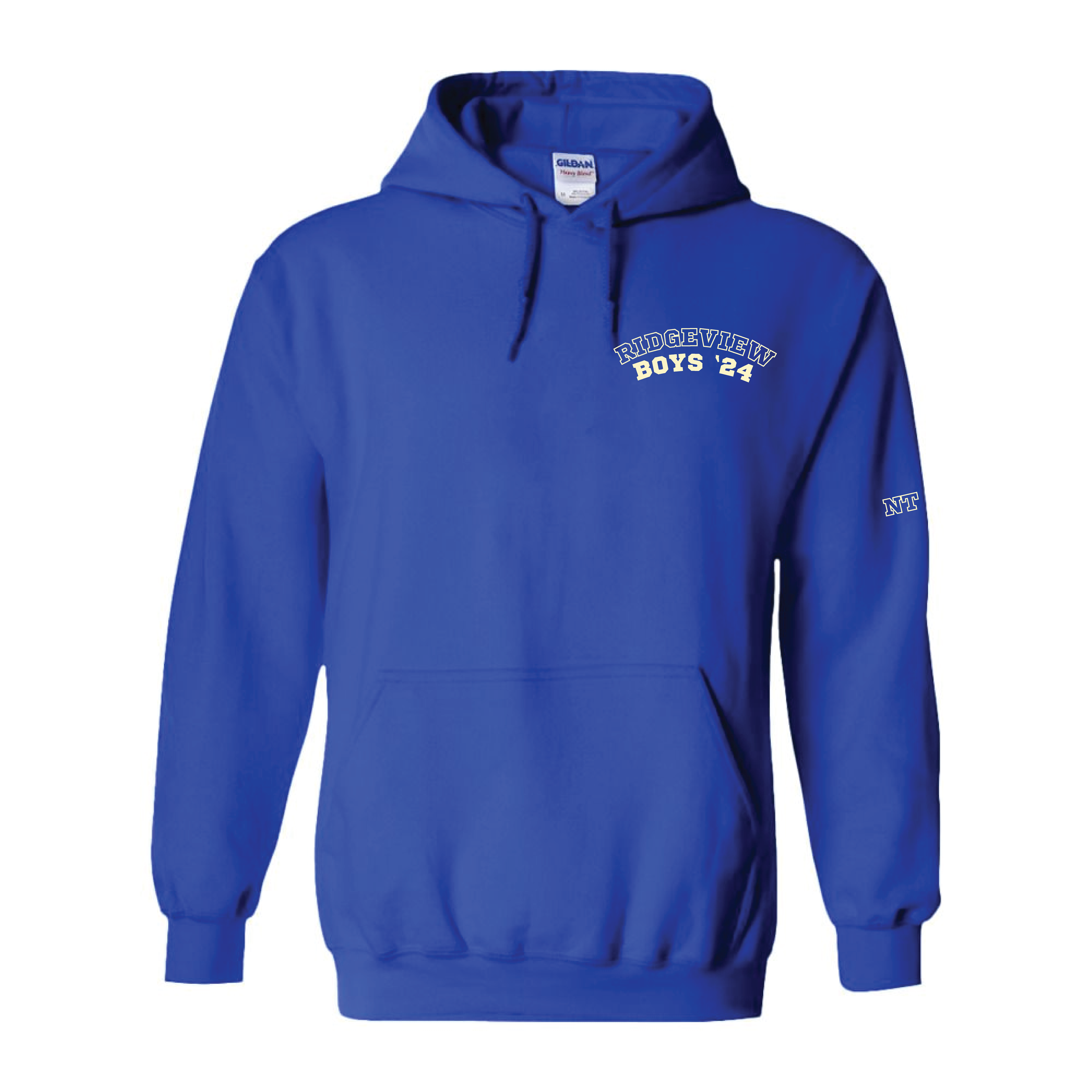
One of my key projects was the Ridge View Boys logo, created for an all-boys unit of 12–13-year-olds. This design needed to embody a strong sense of camaraderie and teamwork, so I incorporated a bold typeface and their unit symbol, a duck, to represent the idea of the group ‘flying together.’ I focused on making the design both visually striking and meaningful, ensuring it resonated with the campers and created a sense of belonging. The bold, graphic elements made it easy to translate across different merchandise, from t-shirts to banners, helping to unify the group under a shared identity.


Another standout project was the Rocky Point Boys logo, designed for the youngest boys' unit at camp. The challenge here was to capture their playful, carefree spirit while still making the design feel cohesive and representative of camp life. Together with the unit supervisor, we explored different concepts and landed on the simple yet effective idea of a stick figure lounging in a hammock, sipping a cup of ‘I love YCC’ tea. This visual perfectly encapsulated the relaxed, fun-loving nature of the group. I leaned into a youthful, energetic aesthetic, using typography and iconography that felt lighthearted and dynamic. The final design struck a balance between being simple enough for easy reproduction on merchandise while still conveying the excitement and camaraderie of their camp experience.
