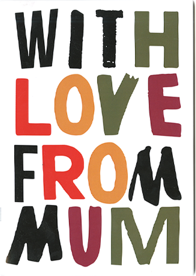
WITH LOVE FROM MUM
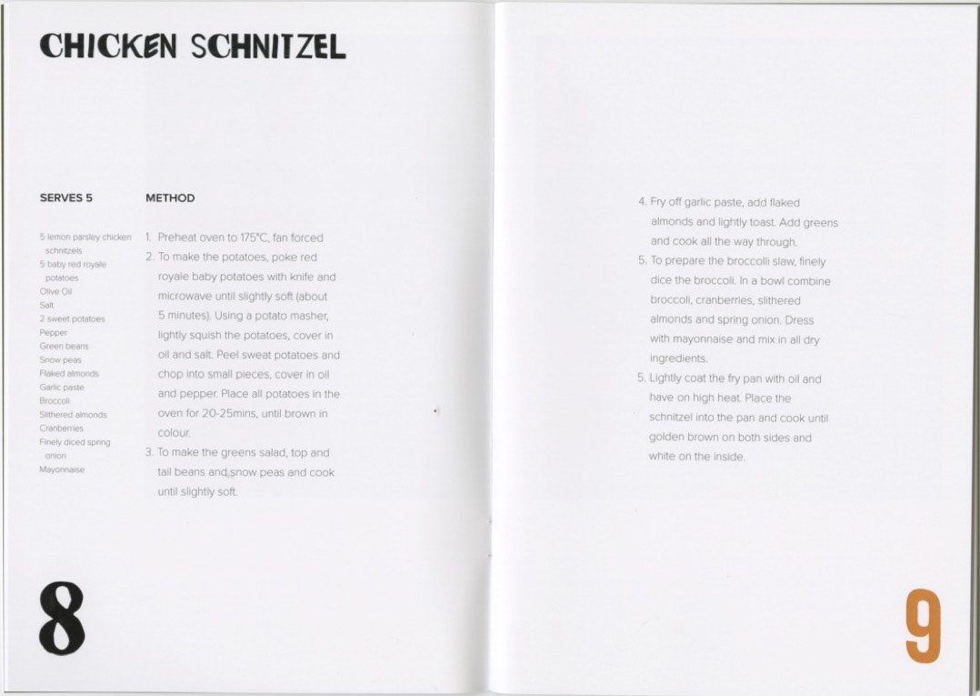
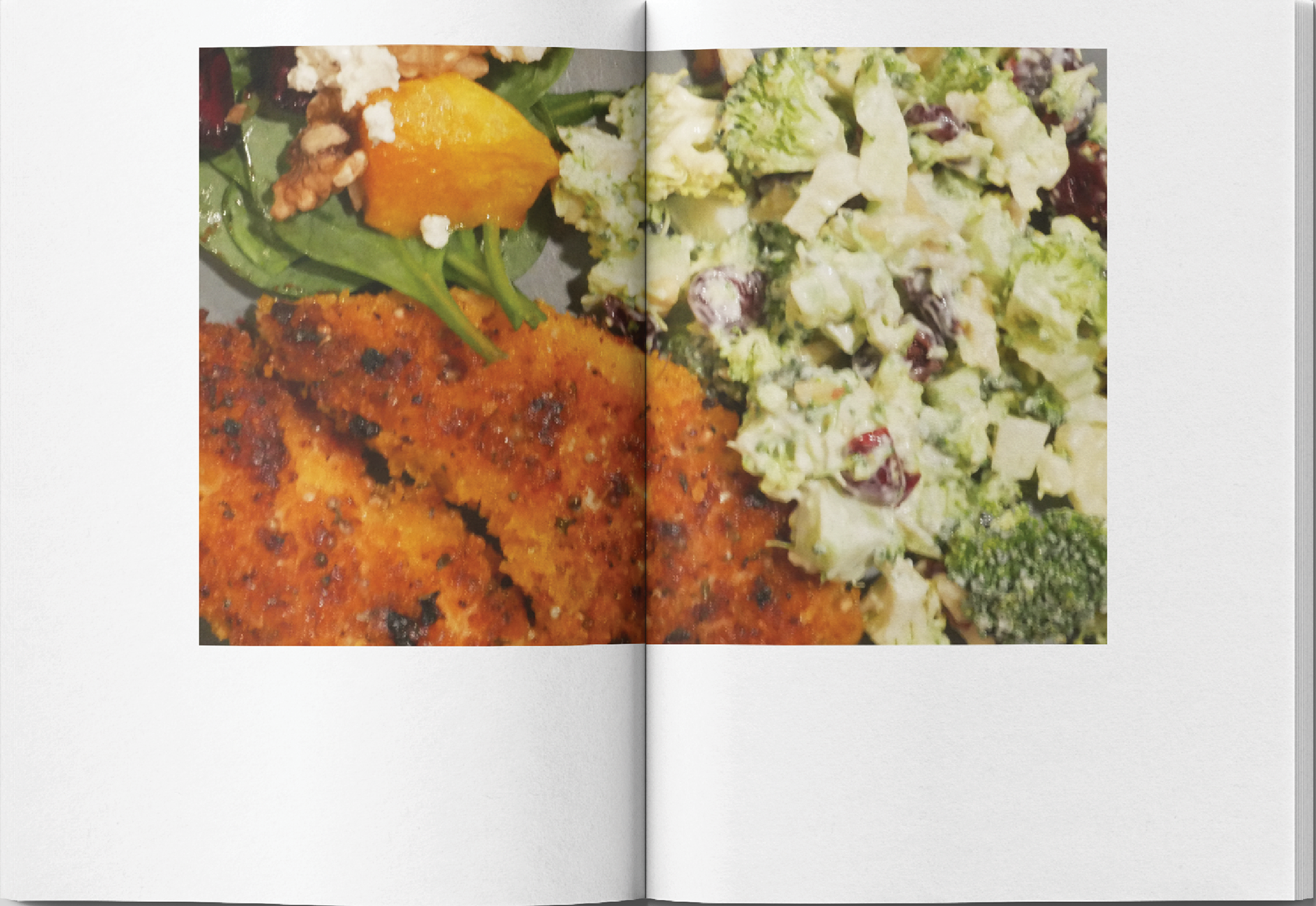
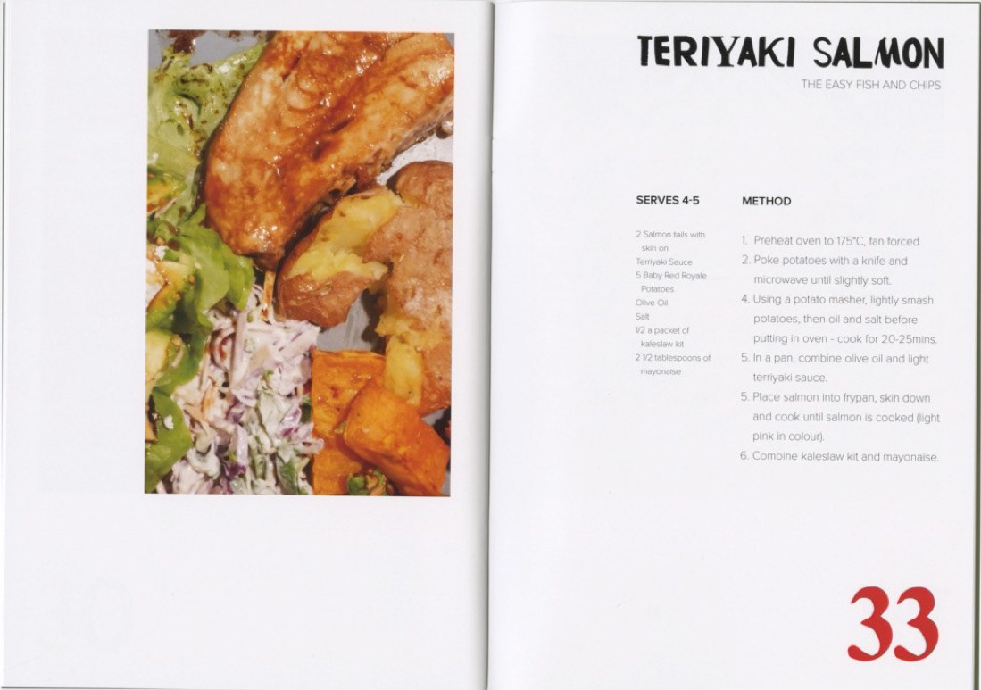
"With Love From Mum" is a recipe book I created for my third-year university project. The brief challenged us to reflect on a personal ‘food memory’ and develop an alimentary identity project. My inspiration came from my mum’s simple yet delicious take on takeaway fish and chips, her homemade Teriyaki salmon, a healthier and more comforting alternative. Much of my mum’s cooking is homely and heartfelt, which sparked the idea to document all her cherished recipes that had never been written down. This cookbook is something I hope to treasure for years to come and share with friends and family.
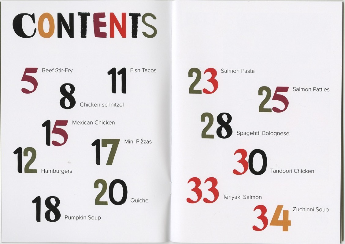
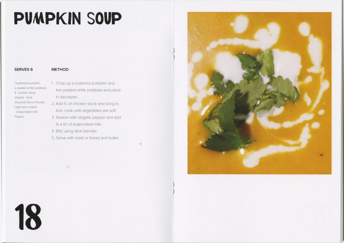
For this project, I wanted to create a typeface that felt personal, nostalgic, and full of character, something that reflected the warmth and authenticity of home-cooked meals. I started by gathering old takeaway menus we had lying around the house, carefully selecting individual letters that stood out. Each letter had its own personality, shaped by different fonts, textures, and imperfections. From this, I began assembling a cohesive typeface, ensuring the mix of characters still felt balanced and visually harmonious. This process gave the project a unique, handcrafted feel that couldn’t be replicated with standard typefaces.
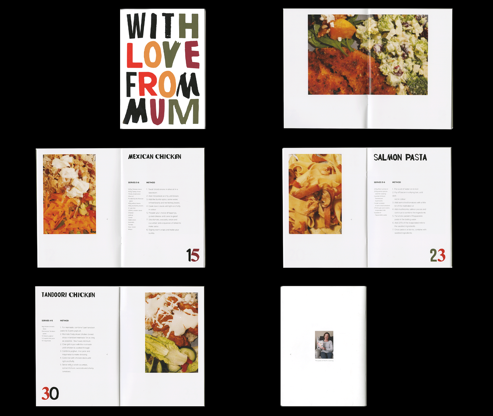
The colour palette played a crucial role in tying everything together. I opted for earthy tones to reflect the homegrown, comforting nature of the book’s theme while incorporating a bold pop of red to symbolise love and passion. The red accent also helped create a strong visual hierarchy, drawing the viewer’s eye to key elements of the design. Through this process, I was able to craft a design that not only looked visually striking but also carried deep personal meaning, making the book feel like a heartfelt tribute to the stories and traditions it represents.
If you're still reading - well done! This is the typeface I created, which you can also see featured in my logo in the top right-hand corner.
