SUSHI
COUNTER
COUNTER
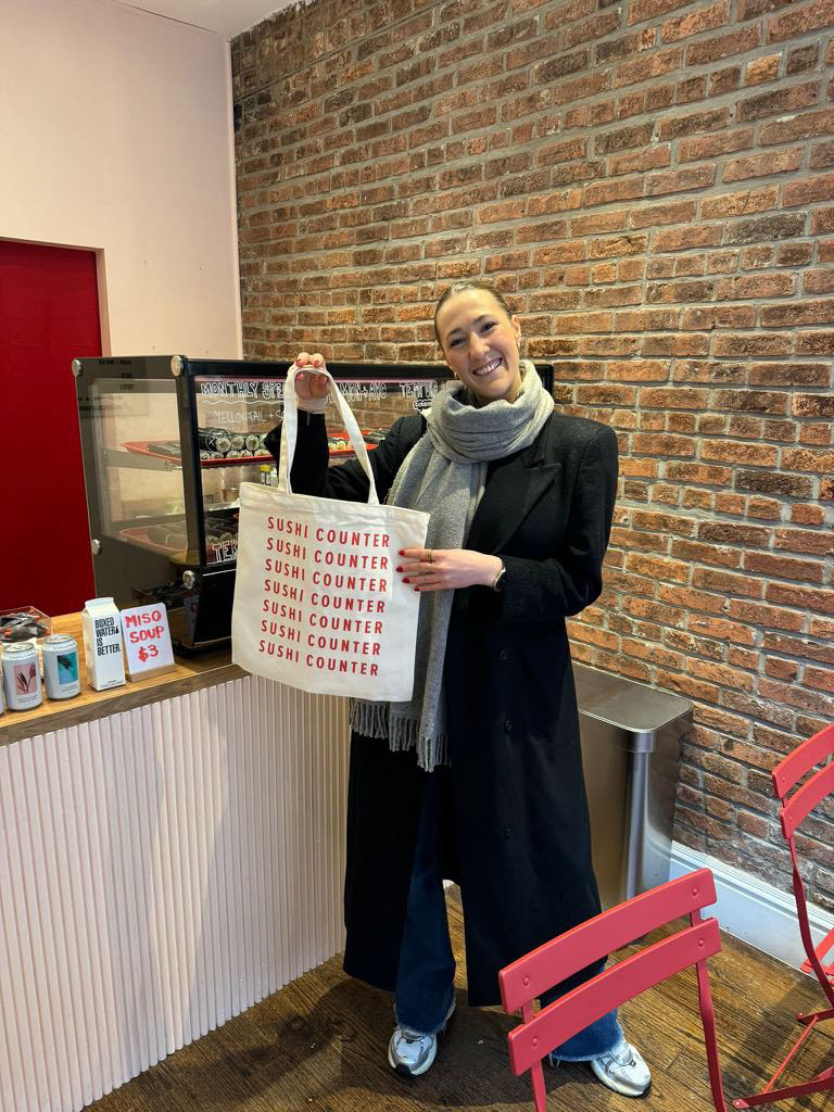
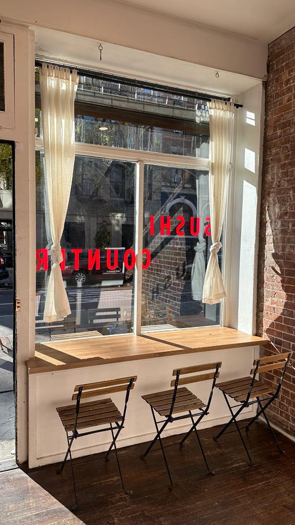
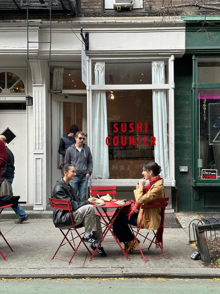
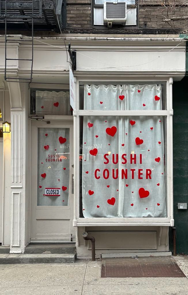
During my time in New York, I had the opportunity to work on the branding for Sushi Counter, an Australian-style sushi shop opened by a family friend, Alex Marks. Located in the heart of Manhattan, Sushi Counter aimed to introduce a fresh take on sushi with an approachable, grab-and-go concept. Alex envisioned a bold, eye-catching brand that would stand out in the competitive New York food scene, drawing inspiration from the vibrant energy of classic ’90s diners. After she generously hosted me for two weeks, I was excited to offer my design skills to help bring her vision to life.
My design process started with developing a strong visual identity that reflected both the nostalgia of a diner and the playfulness of the shop’s name. I explored the idea of incorporating game counters into the lettering of “Sushi Counter,” creating a dynamic and engaging logo. To reinforce the retro theme, I selected a bold cursive font that balanced vintage charm with modern simplicity. The colour palette centred around a striking red, evoking warmth, energy, and the boldness of classic diners. Through this design approach, I was able to craft a cohesive brand identity that not only captured Alex’s vision but also created a memorable presence in New York’s bustling food scene.

